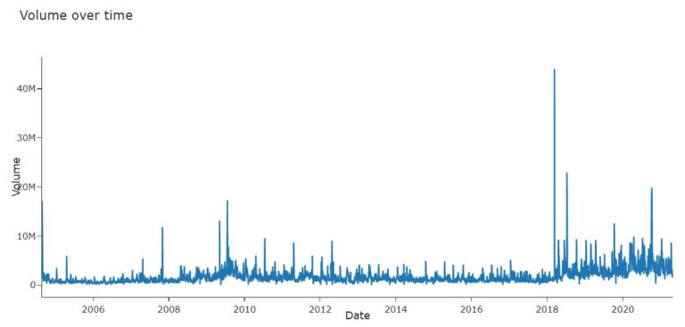
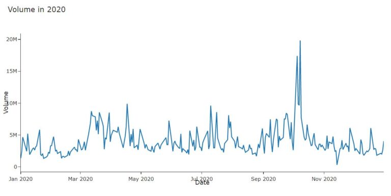
The dataset used is stock market data of the Tata Consultancy Services (TCS) India over the last two decades (2000 – 2019). Here, we are exploring how to predict the VWAP (Volume Weighted Average Price).  VWAP is a trading benchmark used by many traders. VWAP gives the average price the stock has traded at throughout the day, based on both volume and price. Many traders take positions based on the VWAP because of which it becomes very important to predict the value of VWAP.

Data Preparation

# Install the package using the following statement

!pip install pmdarima
 

# Import the required packages

import numpy as np
import pandas as pd
import matplotlib.pyplot as plt
import seaborn as sns
import missingno as msno
import plotly.express as px
import plotly.graph_objects as go
import matplotlib.dates as mdates
import scipy.stats
from sklearn.metrics import mean_absolute_error, mean_squared_error
import pylab
sns.set(style=’white’)
from pmdarima import auto_arima
from statsmodels.tsa.stattools import adfuller
import statsmodels.api as sm
from statsmodels.tsa.seasonal import seasonal_decompose


#Load the dataset

df=pd.read_csv(‘TCS.csv’)
 

#Converting Date into DateTime format

df[‘Date’]=pd.to_datetime(df[‘Date’])
df.set_index([‘Date’],inplace=True)
df.head()
 

# Displaying the summary of the data

df.describe()
df.shape
 

#Checking for the missing values

def missing_values_table(df):
        # Total missing values
        mis_val = df.isnull().sum()
        
        # Percentage of missing values
        mis_val_percent = 100 * df.isnull().sum() / len(df)
        
        # Make a table with the results
        mis_val_table = pd.concat([mis_val, mis_val_percent], axis=1)
        
        # Rename the columns
        mis_val_table_ren_columns = mis_val_table.rename(
        columns = {0 : ‘Missing Values’, 1 : ‘% of Total Values’})
        
        # Sort the table by percentage of missing descending
        mis_val_table_ren_columns = mis_val_table_ren_columns[
            mis_val_table_ren_columns.iloc[:,1] != 0].sort_values(
        ‘% of Total Values’, ascending=False).round(1)
        
        # Print some summary information
        print (“Your selected dataframe has ” + str(df.shape[1]) + ” columns.\n”      
            “There are ” + str(mis_val_table_ren_columns.shape[0]) +
              ” columns that have missing values.”)
        
        # Return the dataframe with missing information
        return mis_val_table_ren_columns
 
missing_table=missing_values_table(df)
missing_table
 

#Visualizing the locations of the missing data

msno.matrix(df)
 

# Removing missing columns which are also not an important feature.

df.drop([‘Trades’,’Deliverable Volume’,’%Deliverble’],axis=1,inplace=True)
 

#Exploratory Data Analysis

#Plot VWAP(Volume Weighted Average Price) over time.

fig = go.Figure([go.Scatter(x=df.index, y=df[‘VWAP’])])
fig.update_layout(
    autosize=False,
    width=1000,
    height=500,
    title=’VWAP over time’,
    template=”simple_white”,
)
fig.update_xaxes(title=”Date”)
fig.update_yaxes(title=”VWAP”)
fig.show()


#VWAP 2019

fig = go.Figure([go.Scatter(x=df.loc[‘2019’, ‘VWAP’].index,y=df.loc[‘2020’, ‘VWAP’])])
fig.update_layout(
    autosize=False,
    width=1000,
    height=500,
    title=’VWAP in 2019′,
    template=”simple_white”,
)
fig.update_xaxes(title=”Date”)
fig.update_yaxes(title=”VWAP”)

fig.show()

#VWAP 2020

fig = go.Figure([go.Scatter(x=df.loc[‘2020’, ‘VWAP’].index,y=df.loc[‘2020’, ‘VWAP’])])
fig.update_layout(
    autosize=False,
    width=1000,
    height=500,
    title=’VWAP in 2020′,
    template=”simple_white”,
)
fig.update_xaxes(title=”Date”)
fig.update_yaxes(title=”VWAP”)
fig.show()

# Open, close,High, low prices over time

cols_plot = [‘Open’, ‘Close’, ‘High’,’Low’]
axes = df[cols_plot].plot(figsize=(11, 9), subplots=True)
for ax in axes:
    ax.set_ylabel(‘Daily trade’)
 

#Open, close, High, low  all are following the same pattern

# Plot Volume over time

fig = go.Figure([go.Scatter(x=df.index, y=df[‘Volume’])])
fig.update_layout(
    autosize=False,
    width=1000,
    height=500,
    template=’simple_white’,
    title=’Volume over time’
)
fig.update_xaxes(title=”Date”)
fig.update_yaxes(title=”Volume”)
fig.show()

#Plot Volume in 2020

fig = go.Figure([go.Scatter(x=df.loc[‘2020’, ‘Volume’].index,y=df.loc[‘2020’, ‘Volume’])])
fig.update_layout(
    autosize=False,
    width=1000,
    height=500,
    template=’simple_white’,
    title=’Volume in 2020′
)
fig.update_xaxes(title=”Date”)
fig.update_yaxes(title=”Volume”)
fig.show()

#Q-Q plot of VWAP is used to determine whether the dataset is distributed a certain way

scipy.stats.probplot(df.VWAP,plot=pylab)
pylab.show()

#Dicky Fuller Test

The Augmented Dickey-Fuller test is a type of statistical test called a unit root test.

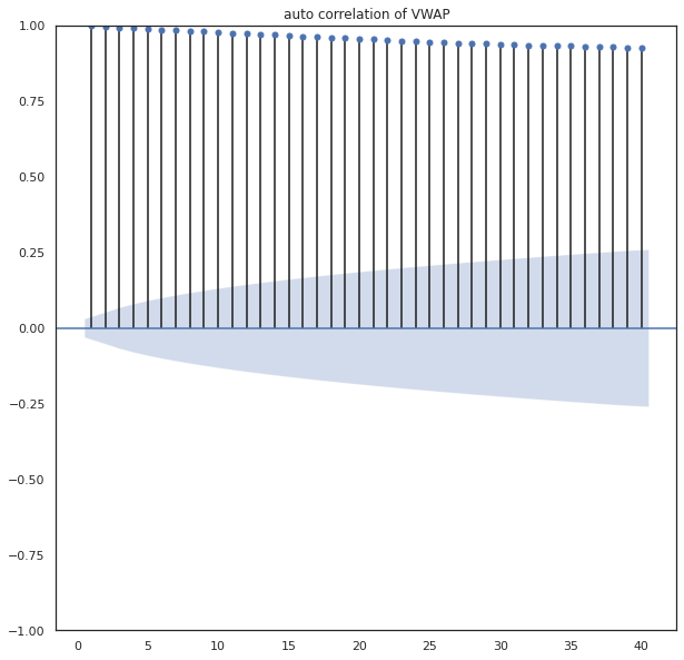
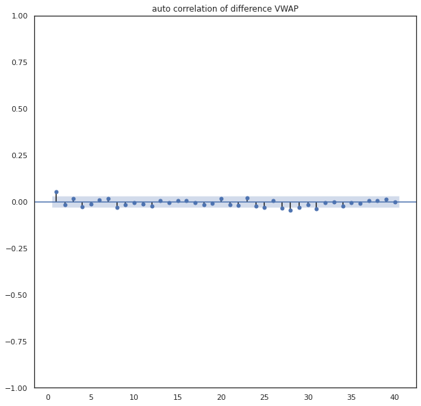
The intuition behind a unit root test is that it determines how strongly a time series is defined by a trend It uses an autoregressive model and optimizes an information criterion across multiple different lag values.

The null hypothesis of the test is that the time series can be represented by a unit root, that it is not stationary (has some time-dependent structure). The alternate hypothesis (rejecting the null hypothesis) is that the time series is stationary.

Null Hypothesis (H0): If failed to be rejected, it suggests the time series has a unit root, meaning it is non-stationary. It has some time dependent structure.

Alternate Hypothesis (H1): The null hypothesis is rejected; it suggests the time series does not have a unit root, meaning it is stationary. It does not have time-dependent structure.

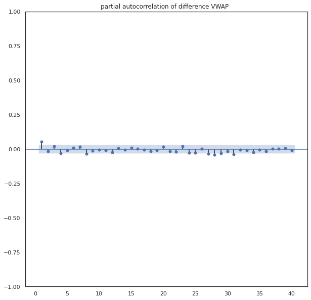
We interpret this result using the p-value from the test. A p-value below a threshold (such as 5% or 1%) suggests we reject the null hypothesis (stationary), otherwise a p-value above the threshold suggests we fail to reject the null hypothesis (non-stationary).

p-value > 0.05: Fail to reject the null hypothesis (H0), the data has a unit root and is non-stationary. p-value <= 0.05: Reject the null hypothesis (H0), the data does not have a unit root and is stationary.

def dicky_fuller_test(x):
    result = adfuller(x)
    print(‘ADF Statistic: %f’ % result[0])
    print(‘p-value: %f’ % result[1])
    print(‘Critical Values:’)
    for key, value in result[4].items():
        print(‘\t%s: %.3f’ % (key, value))
    if result[1]>0.05:
        print(“Fail to reject the null hypothesis (H0), the data is non-stationary”)
    else:
        print(“Reject the null hypothesis (H0), the data is stationary.”)
 
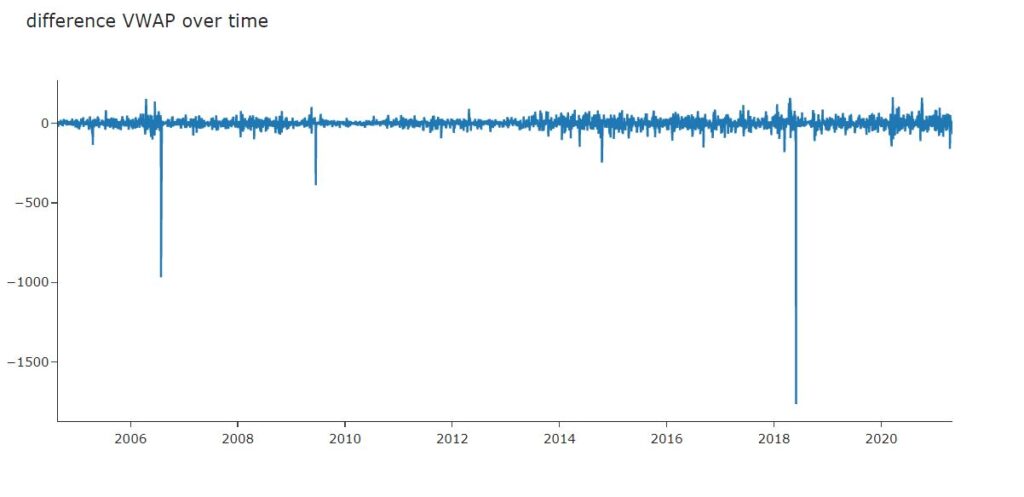
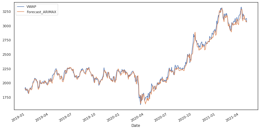
dicky_fuller_test(df[‘VWAP’])
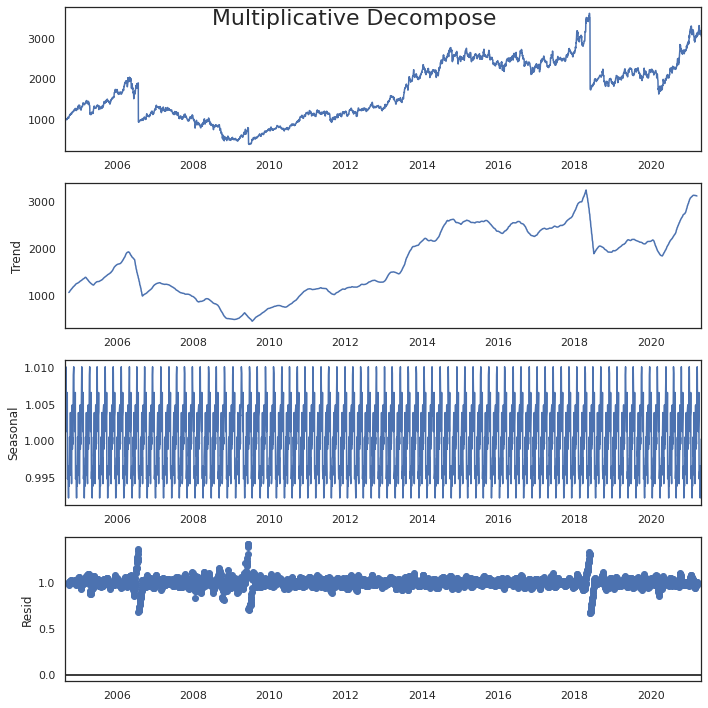
 

#Seasonal Decompose

from statsmodels.tsa.seasonal import seasonal_decompose
from dateutil.parser import parse

plt.rcParams.update({‘figure.figsize’: (10,10)})
y = df[‘VWAP’].to_frame()


# Multiplicative Decomposition 
result_mul = seasonal_decompose(y, model=’multiplicative’,period = 52)

# Additive Decomposition
result_add = seasonal_decompose(y, model=’additive’,period = 52)

# Plot
plt.rcParams.update({‘figure.figsize’: (10,10)})
result_mul.plot().suptitle(‘Multiplicative Decompose’, fontsize=22)
result_add.plot().suptitle(‘Additive Decompose’, fontsize=22)
plt.show()

#Convert Stationary into Non-Stationary

# Differencing

df[‘vwap_diff’]=df[‘VWAP’]-df[‘VWAP’].shift(1)
 
fig = go.Figure([go.Scatter(x=df.index,y=df.VWAP)])
fig.update_layout(
    autosize=False,
    width=1000,
    height=500,
    template=’simple_white’,
    title=’VWAP over time ‘)
fig.show()
 
fig = go.Figure([go.Scatter(x=df.index,y=df.vwap_diff)])
fig.update_layout(
    autosize=False,
    width=1000,
    height=500,
    template=’simple_white’,
    title=’difference VWAP over time ‘)
fig.show()
 

There is no need to convert the time series data into stationary data. This is done only for the purpose  knowing how to check stationarity and how to convert non-stationary data into stationary data.

# Autocorrelation and partial autocorrelation plots

#Auto correlation of VWAP

sm.graphics.tsa.plot_acf(df[‘VWAP’].iloc[1:], lags=40,title=’auto correlation of VWAP’,zero=False)
plt.show()
#Auto correlation of difference VWAP
sm.graphics.tsa.plot_acf(df[‘vwap_diff’].iloc[7:], lags=40,title=’auto correlation of difference VWAP’,zero=False)
plt.show()


Auto correlation of VWAP
Auto correlation of difference VWAP
#Partial auto correlation of VWAP
sm.graphics.tsa.plot_pacf(df[‘VWAP’].iloc[1:], lags=40,title=’partial auto correlation of VWAP’,zero=False)
plt.show()
 
#Partial auto correlation of difference VWAP
sm.graphics.tsa.plot_pacf(df[‘vwap_diff’].iloc[1:], lags=40,title=’partial autocorrelation of difference VWAP  ‘,zero=False)
plt.show()
Partial auto correlation of VWAP
Partial auto correlation of difference VWAP

# Feature Engineering

Adding lag values of High, Low, Volume, Turnover, will use three sets of lagged values, one previous day, one looking back 7 days and another looking back 30 days as a proxy for last week and last month metrics.

df.head()

df=df.reset_index()
lag_features = [“High”, “Low”, “Volume”, “Turnover”,”Close”]
window1 = 3
window2 = 7
window3 = 30

df_rolled_3d = df[lag_features].rolling(window=window1, min_periods=0)
df_rolled_7d = df[lag_features].rolling(window=window2, min_periods=0)
df_rolled_30d = df[lag_features].rolling(window=window3, min_periods=0)

df_mean_3d = df_rolled_3d.mean().shift(1).reset_index().astype(np.float32)
df_mean_7d = df_rolled_7d.mean().shift(1).reset_index().astype(np.float32)
df_mean_30d = df_rolled_30d.mean().shift(1).reset_index().astype(np.float32)

df_std_3d = df_rolled_3d.std().shift(1).reset_index().astype(np.float32)
df_std_7d = df_rolled_7d.std().shift(1).reset_index().astype(np.float32)
df_std_30d = df_rolled_30d.std().shift(1).reset_index().astype(np.float32)

for feature in lag_features:
    df[f”{feature}_mean_lag{window1}”] = df_mean_3d[feature]
    df[f”{feature}_mean_lag{window2}”] = df_mean_7d[feature]
    df[f”{feature}_mean_lag{window3}”] = df_mean_30d[feature]
    
    df[f”{feature}_std_lag{window1}”] = df_std_3d[feature]
    df[f”{feature}_std_lag{window2}”] = df_std_7d[feature]
    df[f”{feature}_std_lag{window3}”] = df_std_30d[feature]

df.fillna(df.mean(), inplace=True)
 

df.set_index(“Date”, drop=False, inplace=True)
df.Date = pd.to_datetime(df.Date, format=”%Y-%m-%d”)
df[“month”] = df.Date.dt.month
df[“week”] = df.Date.dt.week
df[“day”] = df.Date.dt.day
df[“day_of_week”] = df.Date.dt.dayofweek
 
 
df.head()
 
df_train = df[df.Date < “2019”]
df_valid = df[df.Date >= “2019”]

exogenous_features = [“High_mean_lag3”, “High_std_lag3”, “Low_mean_lag3”, “Low_std_lag3”,
                      “Volume_mean_lag3”, “Volume_std_lag3”, “Turnover_mean_lag3”,
                      “Turnover_std_lag3″,”High_mean_lag7”, “High_std_lag7”, “Low_mean_lag7”, “Low_std_lag7”,
                      “Volume_mean_lag7”, “Volume_std_lag7”, “Turnover_mean_lag7”,
                      “Turnover_std_lag7″,”High_mean_lag30”, “High_std_lag30”, “Low_mean_lag30”, “Low_std_lag30”,
                      “Volume_mean_lag30”, “Volume_std_lag30”, “Turnover_mean_lag30”,
                      “Close_mean_lag3”, “Close_mean_lag7″,”Close_mean_lag30″,”Close_std_lag3″,”Close_std_lag7″,”Close_std_lag30”,
                      “Turnover_std_lag30″,”month”,”week”,”day”,”day_of_week”]

#Auto ARIMA model

model = auto_arima(df_train.VWAP, exogenous=df_train[exogenous_features], trace=True, error_action=”ignore”, suppress_warnings=True)
model.fit(df_train.VWAP, exogenous=df_train[exogenous_features])

forecast = model.predict(n_periods=len(df_valid), exogenous=df_valid[exogenous_features])
df_valid[“Forecast_ARIMAX”] = forecast
 
# Model Summary
model.summary()
 
# Plot VWAP vs Forecast ARIMAX
df_valid[[“VWAP”, “Forecast_ARIMAX”]].plot(figsize=(14, 7))

#Analyzing residuals

residuals=df_valid.VWAP-df_valid.Forecast_ARIMAX
 
dicky_fuller_test((residuals))
 
#Plot residuals
residuals.plot()
Residuals

# Model Evaluation

print(“RMSE of Auto ARIMAX:”, np.sqrt(mean_squared_error(df_valid.VWAP, df_valid.Forecast_ARIMAX)))
print(“\nMAE of Auto ARIMAX:”, mean_absolute_error(df_valid.VWAP, df_valid.Forecast_ARIMAX))